Wednesday 1 February 2012

Pyramid Park at The Triangle, NYC


This proposal was for an AIDS Memorial Park in NYC. It was entered for a competition and although fees were paid and it was submitted before the deadline, for some reason it was not considered as part of the competition. Not that it makes any difference, because what was submitted was a very different approach to the other entries, so would have been unlikely to get anywhere. I present it here, because despite its faults, how we approach urban public space is an important issue and placing ideas in the public domain helps create the momentum for a change in attitude.
The memorial is in remembrance of more than 100,000 New York City men, women and children who have died from AIDS. The garden is to be on the site of the former St. Vincent’s Hospital, centre of the AIDS crisis in the 1980s, which tragically went bankrupt in April 2010. 'For many years, the community has expressed desire that the triangle of land that is the site of St Vincent's be turned into a public park. Like most of Lower Manhattan, the West Village is starved of public, green, open places for relaxation' and so as part of that redevelopment, this site is being redesigned as new public open space. 


                                                          Keith Haring with artwork

As a designer, I felt that if a memorial garden was to have any meaning then it had to start, at its essence, with something from that time and place - a seed that would grow the project. This led me to Keith Haring, whose artwork 'ignorance = fear' was a very powerful comment on what began to happen at the start of the epidemic. Keith died of AIDS related illness in 1990 and his style, 'derived from New York street art', contained a geometry that could contain not only a sense of place, but a way of bringing green space into the distorted geometry of the site. What I would need to discover is if visually the two could work together to create a place you might want to spend time in. 


     Berle  Marx : Copacabana      and        Hampton  Court  maze  


There is a history of successful garden designs starting with artwork, most notably the public spaces created by Berle Marx in Brazil and Florida and the geometry that started to evolve in the Pyramid Park design seemed to have similarities to other geometric garden forms such as a maze and of course, this has a symbolic meaning for a memorial about an emerging disease.


I then looked at local paper 'The Village Voice', reading comments by local people to see their concerns and looking for clues as to how a new green space would be used. This is of prime importance because the memorial garden was also a green space for everyone and they needed to feel that it would be the kind of place that they could just go to relax.


It was important that the garden would be light as the heights of buildings in NYC create so much shadow. This meant pushing any large trees to the North and North East parts of the site. To avoid any large vertical elements that would be created by the need to contain large tree roots, stepped planted seating was designed and the form of this reflects the form of the building behind, attempting to knit the form of the park into the fabric of the surrounding city. This is not just a 'nice visual thing' it is important symbolically, because the memorial is not something standing apart, it is not something contained on a triangle of land, it is about something that is a part of the city.


Each pathway in the garden layout has its own different character. Although the sharp geometry is softened by nature, the angles of the pathways provide false perspectives; some offer aligned views, others appear blocked - then change direction. Some are small and intimate, but they all lead to the pyramid. The pyramid is formed from frame-less bonded glass to accentuate the visibility between the garden and the void down into the Awareness centre.


The old hospital basement was to become an AIDS Awareness Centre. At the centre of the garden is a glass pyramid. A pyramid form was chosen as it is an ancient symbol of the transition from this world to the next. Being glass, this illuminates the foyer of the Awareness Centre which is under the garden. The pyramid is inscribed with lines from the AIDS Poetry Project, seeking the involvement of people who have a personal emotional history with this place. Their words are projected into the foyer and move with the light.


The entrance into the Awareness Centre is via a lift. The lift is stark and unadorned, it contains no signs and no buttons, all control is taken from you. It looks odd in the garden, as if it shouldn't really be there. It is slow and dark as you descend into awareness. Here all is hard concrete, a big emptiness and oblique views of the greenery in the garden above. 


As I said at the beginning, this proposal was not even considered as an entry for the AIDS Memorial Garden competition. However, it is presented here as a few ideas on one approach to creating green space in an urban setting.


Friday 23 September 2011

Winner - British Homes Awards


View a video of the Santiago Townhouse at :
                                    

Thursday 4 August 2011

The Natural Path Design Approach

'We are all in the same boat on a stormy sea and we owe each other a terrible loyalty”
- G. K. Chesterton
 The Problem:

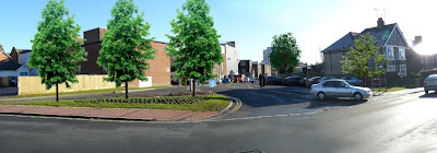
           The worst thing about a horrible urban environment is that people consciously created it. In this countryside town there are very few trees in the main streets - why? In pictures from the 1920s all the streets were tree lined and look very attractive, and yet there was a conscious decision to remove them. Now you might think the road needed to be widened for traffic except that the alignment of buildings are the same, so it wasn't that. All the trees were removed in the name of 'sight lines' so traffic can see what is happening at the other end of the road. When this happens the traffic speed increases. So 'traffic calming' measures are installed to slow it down. And since fast moving traffic is a danger to the public, metal barriers have been installed. People are treated like animals, corralled along a route and this cannot be the most effective way to create a pleasant sustainable environment.
              There is another reason for the metal barriers. “To save money” the pavement has been treated the same way as the road and has a tar-mac surface. This is a false economy as metal barriers are needed to define the bit that is for traffic as there is really no other way to tell the difference. The tar-mac pavement also sends out a visual signal that the pavement is really for traffic so is it any surprise that people don't walk?


            Approximately £25,000 has been spent on street furniture that has almost no use, so there is not a shortage of funds. I questioned a Council member on this issue and received the response, “if we don't do things we don't get the funding”. So funding is available but it is being wasted to fulfil a quota rather than actually improve the town. As the Habitat Action Plan for Sussex states: 'the potential for improving the biodiversity of urban areas is tremendous'.

The Proposal:


            This proposal seeks to create a 'natural path' using extensive tree planting, flower beds and natural surfaces to form a route linking existing green spaces into an integrated habitat that weaves through the urban environment. This creates a more pleasant pedestrian environment, which encourages people to walk and so reduces pollution.

   
           Traffic is integrated into these proposals with 'parklets' (above) since it is recognised that traffic is currently linked to economic vitality. This proposal seeks to link green sustainability to economic sustainability, demonstrating the value of such proposals.
        The poorest part of the urban environment is also the poorest part of town and it is proposed that this is linked this to the High Street by a combination of resurfacing, trees and purpose-made planters to act as screens to the traffic intersection. Businesses are struggling, so parking is integrated into this proposal. This integration of parking along the natural path also has the benefit of negating the need for more car parks and so helps contain traffic pollution within an existing defined area.


                                  Car Park without trees above and after planting below


           The proposed trees reduce acid rain, improve air quality, act as a carbon sink, sound buffer, reduce wind speeds, give shade, both humidifying and reducing the 'heat island' effect as well as creating wildlife habitats. The removal of pollutants by trees is a localised effect and it is incredible that such a simple and natural solution is so often ignored.


                               High Street without trees above and after planting below


           'The Pavilion' proposed between the High Street and Park is currently occupied by public toilets that are in a bad state of repair. This is a commercial venture that seeks to re-new the public toilets at no cost to the public purse. This would also provide the finance for the town centre enhancements.
 

             Designalexable introduced a PLC company to the Council willing to undertake this part of the proposal. The offer was to lease the site of the existing toilet block for a new café/restaurant with new public toilets constructed as part of the proposals.
          As the Council would need funding for the greening of the town centre proposals and because these would have a positive trading effect for the operator, it was decided that the usual rent free period would become a lower rent period. So, the Lessee would pay the Council £30,000 PA + business rates for the first 5 years to offset the construction costs. After five years this would increase to £60,000 PA + business rates for the next five years and after that an open market rent.
          This immediate income to the Council could be used to cover the Council deficit to help prevent a reduction in services. But, why would a company enter into such an agreement? The reason is simple, the four main restaurants in the town each take approximately £20k per week. There are secondary restaurants with takings of approximately £10-15K per week. The site of the new Pavilion restaurant would be the best pitch in town. It would be the most visible to through traffic. It would have the best views and be easily accessible from the high street, park or restaurant area. It would be the only place to be when there were events on in the Summer.


            Does the town really need a restaurant or a café in this location? The answer is no and there is no valid assertion that public money should be spent on such a project. The Pavilion is only really required as a generator to fund the rest of the proposals. Once that is acknowledged it becomes important that the design does not dominate the park, but integrates into the environment.
          The Pavilion is cut into the hillside and operates on different levels. At street level, the pavilion seems small and is seen set within a courtyard sedum blanket roof garden bringing the park into the town and so becoming part of the greening proposals. 


           Gardens and glass houses have a communal history, but this needs to be a pleasant environment to sit and have a drink. South facing solar shades are water filled and act as heat collectors. The 80% recycled fret cut aluminium sun screens act as security shutters when the building is closed. On the upper level these are cut as a grove of saplings to act as both a green image of intent for the project and as a way of identifying with the level of the trees beyond. Tree shadows move across animating the environment with natural imagery. At Park level the screens use a plant pattern taken from the ceiling of a local church by William Kemp, reinforcing the 'sense of place' by connecting to the local history of the area. 

  
                                                   Detail of tree screens at street level.

 
           There is a continuing understanding that all our social, economic and environmental issues are inextricably linked and we breathe in our surroundings with all our senses. It has been the intention to present the green technologies used in this proposal in an integrated, unobtrusive way appropriate to the town so that they appear as simply the natural thing to do. So, in a sense this proposal is really just a signpost, an advert for the integration of nature within the built environment and seeks to demonstrate what might be achieved through small scale intervention in times of economic hardship.
                I was helped on the design research by my sister Danielle. She discovered that 100 years ago the park had been Mr Pannetts sheep field.

                       Danielle suggested that we design something for children that connected this history to the park. Her design is for sheep that when the children sit on them, their movement makes the sheep go "baaaaaa".


              I want you to copy this idea. I don't mean pinch the design, that's different. I mean COPY THE IDEA: look around you, think how you would make things better and visualise them. Propose something for your community no matter how simple. Don't do this as part of any 'political' motive, do it because it is a wonderful thing to do. It need not cost money, there are plenty of grants for the planting of trees or making the public domain more accessible. But if you don't want to go that route, get people to sponsor a tree maybe tagged with the name of a loved one. Or follow this example and use a commercial project to act as funding generator. Think of it this way: the people who laid out Regents Park, London or Central Park, NYC would never have seen what we see today. Trees take time to grow so they didn't do it for themselves, they did it for us. A present from the past for our enjoyment. Gestures like that are needed for those that follow us. So let's try and leave something worth leaving.

                                                      Proposed new seating in the park


               A video of the park proposals can be seen at: 
    http://www.youtube.com/watch?v=WKQYDgLpcBY&feature=related

               A review by The Little Green Mag can be found at:
   http://www.thelittlegreenmag.com/#/architecture-blog/4554359221

Saturday 23 July 2011

Social Entrepreneurship : The British Museum Proposal


 This is an idea based in the concept of social entrepreneurship and seeks to raise funding for a museum through a commercial venture. Think of it as a form of commercial exploitation where a learned institution exploiting commerce to raise funding. This already happens: The Great Court at the British Museum is a separate legal entity to the rest of the museum and a global conglomerate leases and operates the café and restaurant within the space. The thing is, I have two sisters who have worked at the museum and both say that they constantly receive complaints about these operations, so as someone involved in restaurant design with contacts in this area I could see that there was an opportunity.
                 At first I went the route of trying to get a sub-lease on one of these operations, but there is kudos involved for a global conglomerate, so that wasn't an option. I then looked at trying to find a space within the museum, but they need more space and are trying to build an extension. So, I had to think of it another way.
                   Visitors numbers for the British Museum in 2012 are predicted to be in excess of six million visitors so there is a captive audience and as the Great Court can get hot and stuffy many prefer to sit outside when the weather is good. So, I looked at placing a temporary pavilion outside the main entrance on the East lawn, positioned so that it does not have an impact on the front entrance.
 

              To present any proposal the figures have to balance. So, I looked at how this would break down: A café/restaurant that served alcohol in this location might reasonably expect to turn over £15,000 per week. Multiply by 52 weeks gives a total of £780,000 = 2.6% of visitors spending £5. So, if we estimate an approximate build cost of £200,000 we would arrive at £580,000. Subtract a rent of at least £60,000 (it may be possible to negotiate this to (£100,000) and (working on £60,000) would give a figure of £520,000. Deduct approximately £40,000 for legal fees etc., planning and conservation permissions and other expenses, this figure is reduced to £480,000.
               If we allow say £100,000 for additional running costs, then we are looking at a clear profit before tax of £380,000 in the first year. And as the building is moveable, if the operator wants, after the first year they can take it away and sell it. Or, if it's popular, negotiate another year. In austere times of volatile investment this could look like a relatively less risky investment.
For the museum, they get £60-100,000 to add to their yearly budget and all they have to do is reach an agreement. In addition to this there is a proposal for a profit sharing agreement on profits in excess of £100,000.

Originally I thought of the building as a sculptural object, but the British Museum is Listed Grade I and as anything in this location would require Planning and Listed Building consent and this would need to be obtained with the minimum of fuss. So, something was needed that did not try to compete with the main building, that could be seen as part of it and yet was distinctive enough to attract visitors without the need for signage.

 The pavilion is sited a little like the temple of Athene Nike on the Acropolis in its relationship to the main building, playing a game with the reference embedded there. So, from the street the wall of 360° revolving aerofoil doors contain, on one side, resin panels of the Parthenon marbles, emulating the freeze on the portico. Although this might sound 'tacky', few people might realise that the bust of Rameses in the Great Court, at the entrance to the Egyptian Galleries, is actually a resin replica. This use of the Parthenon panels is also conscientiously contentious and that is good for business.

                          But the front elevation is not static, the doors revolve 360° and the internal panels are fret cut, back illuminated ancient scripts. There is a whole thought process associated with the scripts that I won't go into here – but these panels are presented in a modern way that at night could be very dramatic, illuminating the way with words.
                          The building when viewed from the museum has a very different character: that of a glass cabinet, similar to those inside the museum – only here, the people inside the cabinet are the objects to be observed against a revolving backdrop of classical art and illuminated scripts.


                          The pavilion is designed to be installed in 3 days, so as to avoid fuss at the main entrance to the museum. The factory finished modules are delivered to site in two sections, craned into position and bolted together. The external decking, in pre-formed panels, is then fixed into position. Some on-site finishing would be required, but it is expected that the factory finished module could reduce build costs by 45%.


                 If you have been following this, it is not the aesthetic that is important; the initial decisions in the scheme were only a way of moving the project forward with the minimum of dispute on proposing anything in such a 'sensitive' location. What is important here is the idea: in austere times companies are actively looking for less volatile investment opportunities, museums are looking for funding, and designers are looking for work. So, the idea is for designers to be more pro-active and create the opportunity. The idea works anywhere there is available space and visitor numbers to make the figures balance. Designers! Artists! Architects! Be pro-active: COPY THIS IDEA. Find a local institution that needs funding and propose your own scheme. Viva Social Entrepreneurship! 


    Thanks to Nicolas Durand at Social Entrepreneurship for adding this to the magazine.

    Thanks to Social Entrepreneur magazine for tweeting this post.
    If you are not following them - you should be....
    Thanks also to Conrad Harrison at metamorph96 for the tweet!

Tuesday 12 July 2011

Bar Bar Brighton


Designalexable has been busy and recently completed this unusual little operation which seeks to be a counter service vegetarian diner operation serving tasty tapas style food in stylish surroundings. The  design is derived from the compact form of the building, a deep slither that gives a critical dimension across the width, that controls everything.
It was important, from a trading point of view, that the bar be both the kind of place people might want to have a quick lunch and at the same time the bar needed to transform itself into an exclusive operation at night, a kind of stop on the route to somewhere else. This duality led to diner style booth seating - a style that is very good at this kind of transformation (I  like the diner shots in the film 'After Hours').
To stop the claustrophobic feeling of being in such a deep narrow unit we wanted to mirror all the walls so that there was this multiple reflection a bit like that Brian Eno 'No Pussyfooting' cover. Then we took the idea of printing on mirrors, like those mirror pictures of Monroe and James Dean that were popular in the 1970s. Ditching the frames, oversizing the images and using stylish modern graphics rather than the usual Hollywood icons, we found that we could give the place an identifiable image on a very tight budget.


The Axonometric view above gives some idea of how narrow the unit is and so how difficult it is in design terms to actually fit in this type of operation. The stairs in the bottom right lead down to staff area and prep + stores and have an escape route leading to the street. The Fire Enclosure is situated at the base of the stair so that it allows maximum area around the public toilet.


More on the Santiago Townhouse

It was great to see that Vectorworks, who produce the modeller software I used for the project, supported the scheme by making a post on Twitter. Many thanks to everyone at Vectorworks!

For those of you that didn't see the Santiago Townhouse article in the Daily Telegraph - it looked like this:


You can still vote up to the 22nd July 2011 - so please support this and follow the Link:

http://www.telegraph.co.uk/sponsored/property/british_homes_awards/8582354/British-Homes-Awards-2011-finalist-Santiago.html

 This should take you to a page that looks like this (see Left).


There has been a lot of interest in the whole concept, because the way that the building is constructed reduces costs so that this is effectively affordable housing that can be constructed very cheaply. The design and the materials make the building very low maintenance and some of the Green innovations are currently with the patent office. More on that when we have some protection in place.